Motkraft
Motkraft is a Norwegian energy company established in 2021 to promote simplicity, transparency, and fairness in the electricity market. It offers a straightforward electricity agreement with no hidden costs and focuses on customer satisfaction through a user-friendly app. By leveraging automation, Motkraft aims to provide competitive prices while challenging traditional energy practices.
My role
UX & UI designer
Duration
Part-time job september 2022 - august 2023
Internship summer of 2022
Read-time
5-6 minutes
1. Statement and objectives
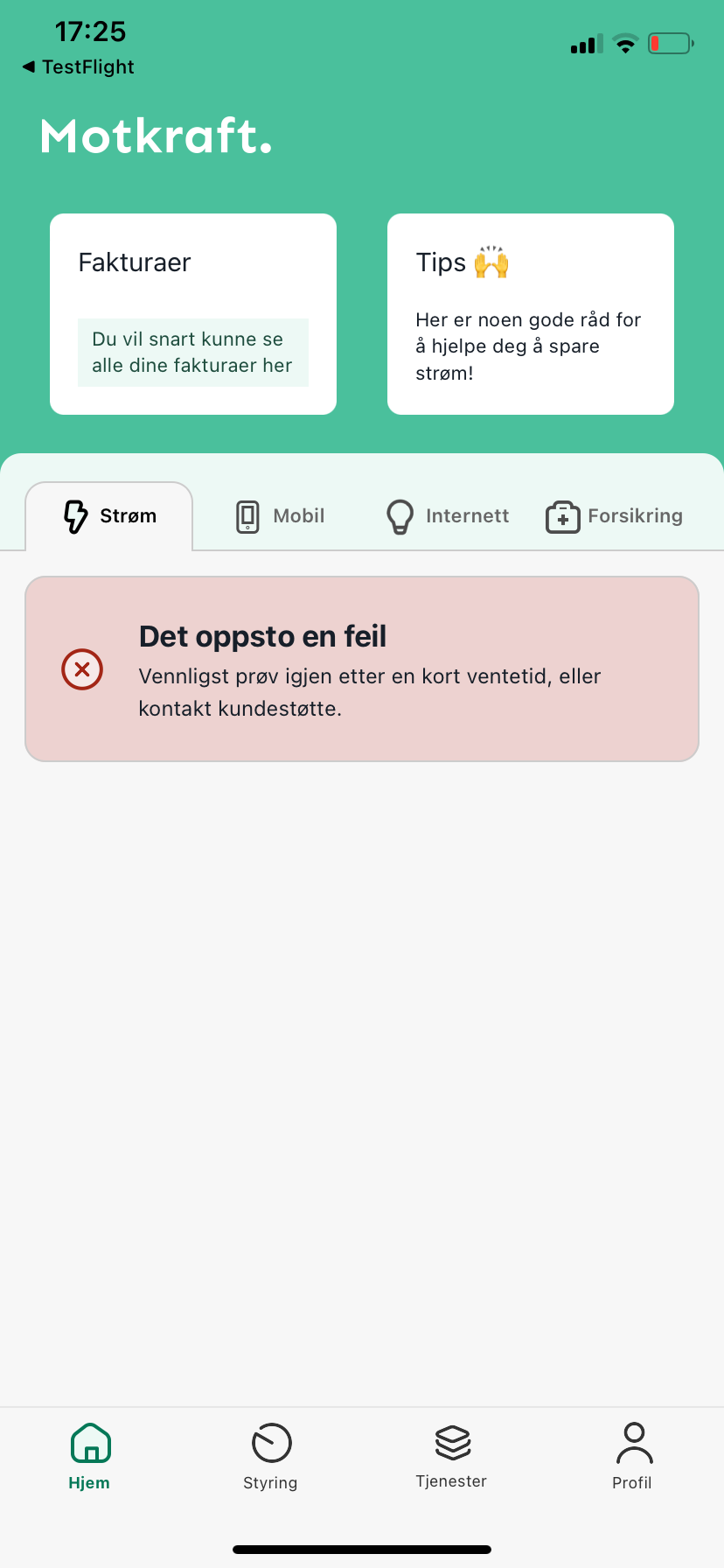
Motkraft, a startup with 50,000 users, was experiencing increasing user frustration due to a cluttered, inconsistent UI and a lack of user-centered design. The app’s identity no longer aligned with its expanding audience, leading to lower user engagement.
The goal was to create a streamlined, cohesive user experience that matched Motkraft’s evolving brand identity while improving usability and scalability for future growth.
Create a satisfied and loyal customer base
Have a design that compliments the essence of Motkraft
Make their app effective and easy-to-use for their customers
Increase rating on the App
Goal
Starting point
2. Design Thinking
Competitive analysis
Personas
Customer Journey
Wireframes and sketches
User interviews
Information Architecture
Prototyping
User testing
User insight and research
After conducting user interviews and analyzing feedback from 100+ users, we discovered common pain points such as navigation difficulties, inconsistent branding, and a lack of intuitive features.
Simplifying the app's navigation to make it easier for users to find specific features.
Remove clutter. There were several screens connected in the app that had no functionality.
Addressing remaining pain points identified through usability testing.
Using these insights, I was able to design an app that met the needs of the users in a higher degree and addressed the pain points identified through research.
Wireframing & Prototyping
I created low-fidelity wireframes to address the key pain points and conducted usability tests with a small group of users to validate the new design before moving to high-fidelity prototypes.
Iterative testing
After each round of user testing, we refined the design based on user feedback. This iterative process ensured that the final design was both visually cohesive and functionally sound.
3. Solution & design enhancements
I introduced a cleaner, more modern layout with intuitive navigation that reduced the number of clicks needed to access key features. A consistent color palette and typography were implemented to enhance brand identity and improve visual hierarchy.
UI improvements
The new visual identity aligned with Motkraft’s growth ambitions, using bold colors and simplified logos that better resonated with the user base. The updated design reflected a more professional, user-focused brand.
Brand identity
I ensured the new design met accessibility standards, incorporating features like high contrast modes and larger touch targets to make the app more inclusive.
Accessibility
4. Results and feedback
Users reported that the new design felt ‘cleaner and more intuitive,’ while stakeholders appreciated the ‘fresh, modern look’ that better represented the brand.
The scalable design allowed Motkraft to roll out new features without compromising the user experience, ensuring the app could grow alongside its expanding user base.
Long term value
After the new launch rating went from 1 to 4.5 in AppStore.
Takeaways & reflections
Leading the Motkraft redesign taught me the importance of collaboration between design and development teams to create scalable solutions. It also reinforced the value of continuous user feedback to ensure we were solving real problems.
Future applications: This project deepened my understanding of user-centered design and scalability, skills I now apply to all of my design work.


